


As you’re trying to figure out what to wear for your next family photos, a good place to start is to figure out your best colors for family pictures outside. Once you have a color palette in mind, it’s usually much easier to shop for clothing for pictures. I’ve rounded up my eight favorite outdoor family photo color schemes to help you!
Fall Picture Color Scheme: Burnt Orange Family Pictures
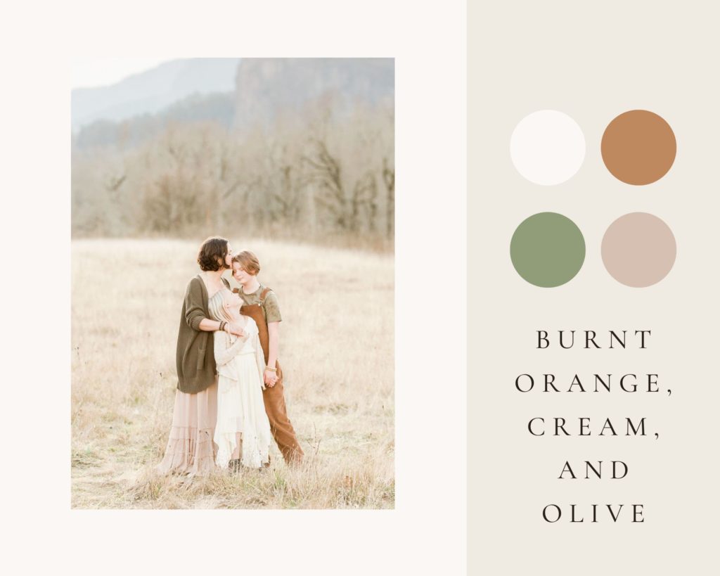
If you’re looking for a fall picture color scheme, burnt orange is an easy way to make a neutral palette become instantly autumn! Some oranges can actually be too bright, reflecting orange back onto subject’s faces. To avoid this, look for a camel or burnt orange that is soft rather than bright, muted rather than vibrant. For burnt orange family pictures, use burnt orange sparingly, in just one family member’s outfit. Balance it with plenty of soft neutrals to keep a light and airy look. Here, this family mixed it with creams, light khaki, and olives for the perfect fall picture color scheme.
Denim and White Family Photos
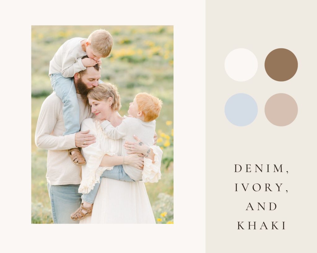
Denim and white family photos get a bad rap! While matching stark white t-shirts and jeans can definitely look outdated, a denim and white color palette for family photos can look so organic and timeless when done right. I encourage clients to think outside the basic white t-shirt: soften the look with cream and ivory instead. Dress up the basic t-shirt by choosing textured henleys, ruffle dresses, and soft gauze for an organic look. Light denim, rather than dark denim, helps to soften the look even further, making the focus all on your family’s connection and emotion rather than heavily contrasted clothing.
Neutral Colors for Family Photos
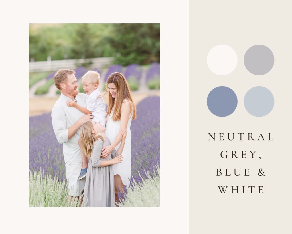
If you’ve been around my website for a while, you can probably tell that neutral colors for family photos are my absolute favorite! They look clean and timeless and they aren’t distracting. All of the focus is on your family, not the outfit colors. While most of the examples on this page show neutral examples of the best colors for family pictures outside, this one is the most neutral. It’s so important when you’re doing all neutrals to layer several different neutrals together so that your photo will have some depth. Here, my clients did mostly white, with dove grey, khaki, and slate blue layered in. It was the perfect choice to let the colorful purple background do the heavy lifting.
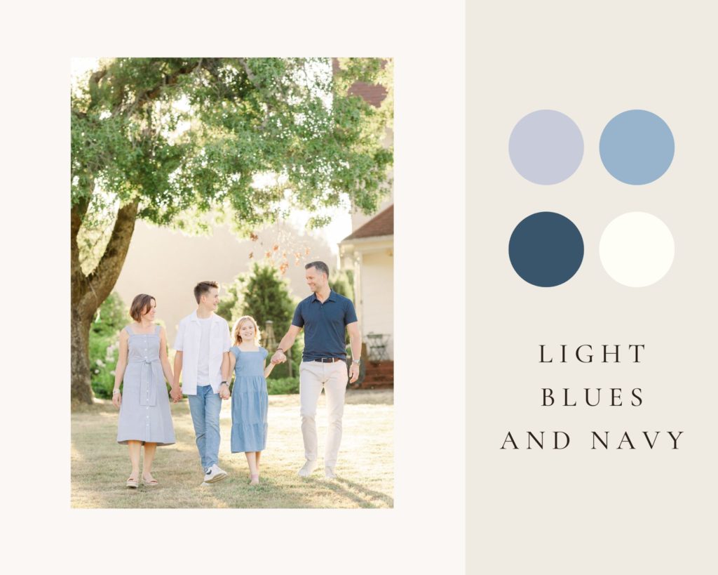
Blue and Green Family Photo Outfits
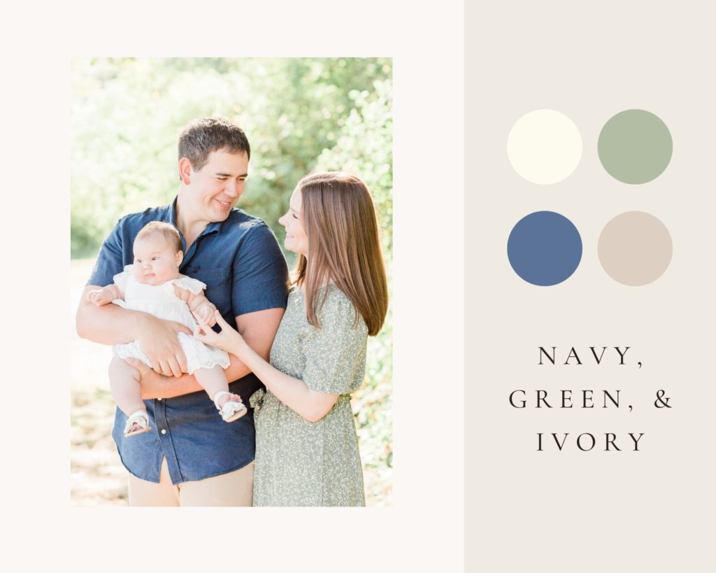
When you’re wondering what the best colors for family pictures outside are, blue and green family photo outfits are a pretty safe bet. For clients who prefer more color than an all or mostly neutral palette, a blue and green color palette is a great solution. They’re universally flattering, they can still look soft and neutral, and they’re easy to find year-round. If you do go with a darker navy blue, I encourage you to keep it to a minimum: one clothing item in a smaller family or on a few family members in a larger family group. It can make a photo look dark quickly, so just be sure to balance it with plenty of lighter whites, creams, and sage greens like this family did here.
This is another great example of navy blue used sparingly but effectively in family pictures outside. Blue and green complement each other so well. If you’re headed to a location that is very green, pairing light blues and navy can be so beautiful! I love the way this family kept it simple by sticking to different shades of blue paired with white and ivory. These monochromatic color schemes are my favorite for family photos. The key really is to use several shades of your color: from the darker navy (used just sparingly to keep the photo light and airy), to a mid-tone chambray, to the lightest blue in mom’s dress.
Blue and Pink Family Photos
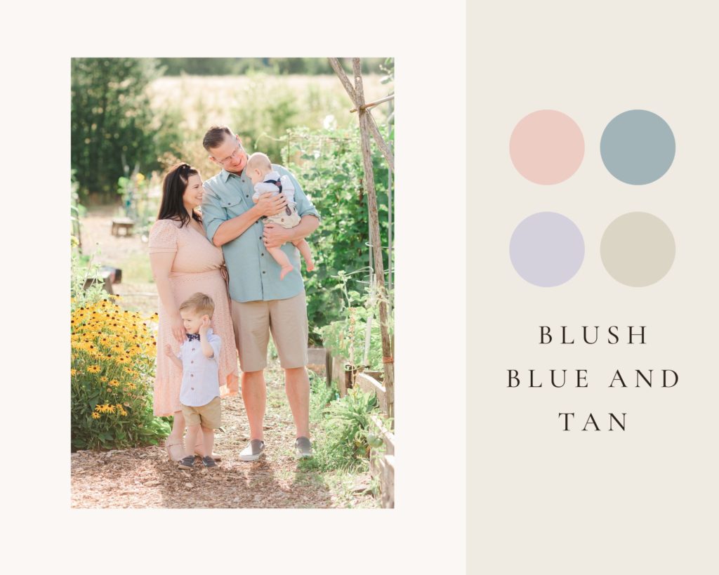
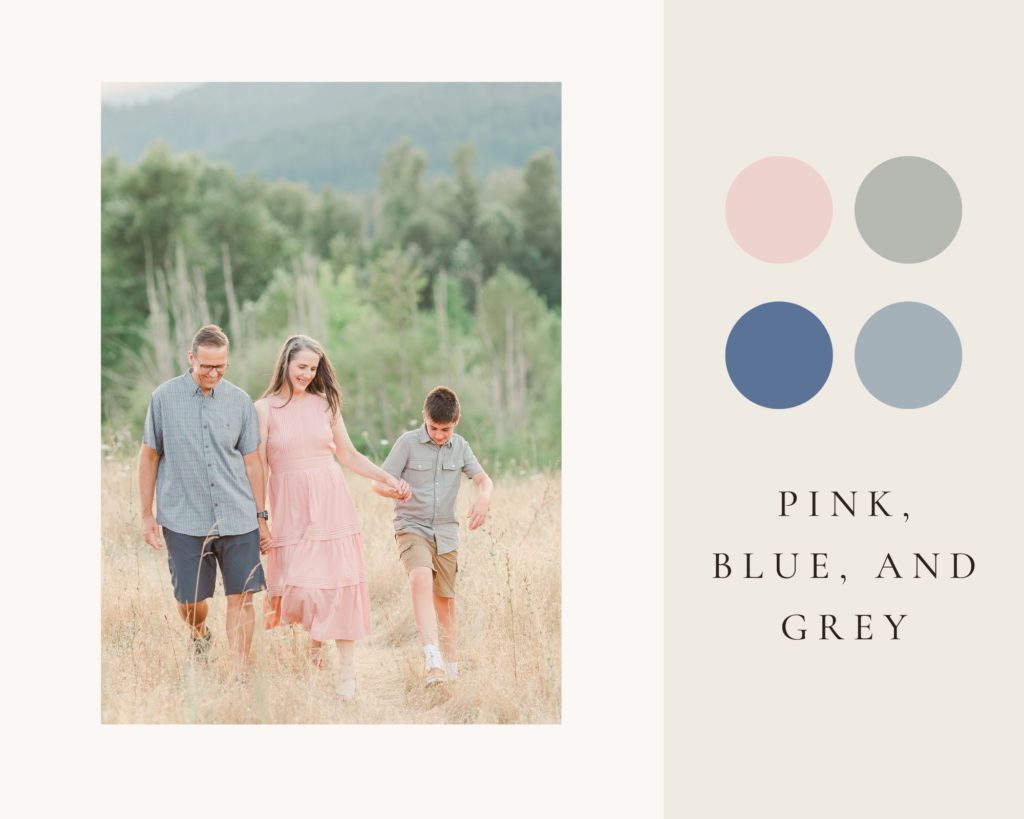
Blue and pink family photos will always have my heart! Outside of warm , light, neutrals, pastel blue and pinks photograph best with a light and airy style. I adore the different ways these families chose to complement pink with their family’s outfits. In the first blue and pink family photo, the family chose warmer tones: khakis and a warm seaglass blue. In the second photo, the tones are cooler, with slate blues and greys. I love how that was reflected in the landscape with the blue mountain in the background. This is a perfect example of how blue and pink family photos are doable for any family, just choose if you’d like to go with warmer tones or cooler tones.
Best Colors for Family Pictures Outside: Beach Photo Color Schemes
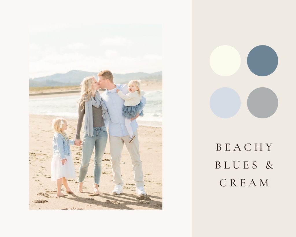
If you’re headed to the beach and looking for the best colors for family pictures outside, one of my favorite beach photo color schemes is light blue and cream! It fits right in the with blue of the ocean and hills in the distance. Layering several neutrals and plenty of textures gives the photo depth. Check out the ruffle tulle of the girl’s dress, the gauze scarf along with ivories, tans, and light greys.
Figured out your best colors for family pictures outside?
If you’ve found your color palette and you’d like help figuring out what exactly to wear, check out some of my other what to wear posts here!
What to Wear for Maternity Photos
What to Wear for Fall Family Photos
Spring Family Picture Outfits
And if you’re ready to book family photos in the Portland area, head over to my website and get in touch!
PS, this week, my favorite blog post from a photographer around the world comes from Ellen Wagner, a family photographer in Alabama. Her post on a maternity session at the Auburn Arboretum was just stunning!


[…] season upon us, you might also want to check out this post by my friend Samantha, as she discusses best colors for family pictures outside. Though I do not have any more availability for fall family sessions this year, these are all […]
I don’t know what I love more… all the awesome fall color inspirations or the fact, that this is probably the most organized and user friendly blog post I’ve recently come across. I love the top color scheme the most, with olive green being my favorite color. It works so well with the burnt orange. Thank you for sharing!
This is so helpful for planning family photos! The visuals and examples are perfect! Love the photos in the lavender field!
You are absolutely right about the burnt orange. It’s a great accent color next to neutrals. I’m going to keep this in mine for my family photos.
Samantha your blog posts are brilliant. I am always looking forward to reading them. So much information and help for your clients. What a great idea to help decide on the colour scheme for family photos. I think I love the burned orange family pictures, especially now for autumn sessions.
Aww, thank you Miriam! It’s so encouraging to hear that, and I’m glad they’re helpful.
Beautiful photos, and I love that you not only give color suggestions but show example pictures of a family wearing them so that your clients can visualize how the colors look together!
LOVE the burnt orange! So many great ideas and the pictures really help with visualizing how the colors will all come together for a family photo session. So helpful!!
Oh my goodness, Samantha! I’m totally obsessed with all the color palettes here. I think my favorite is the green, navy, and ivory combo!
PS I’m totally jealous of your gorgeous scenery!
So glad to hear you love them, Ellen! And yes, we have some really gorgeous places for photos here in Portland!
What a great post to help guide families while picking outfits for their sessions. It’s always so hard to do and having a color palette guide is so helpful.
I absolutely love the color palettes and accompanying images that you have curated in this post! It’s so helpful to see the color palettes in real situations! My favorite is the neutral gray, blue, and white in the lavender field. Beautiful work!
Thank you, Kate, I’m glad it’s helpful to see the real life examples with the palettes! I love the neutrals against the lavender field too!
Samantha, this is a wonderful guide! Not only on what best colors to wear, but also how to make variations of them for a cohesive look and variety amongst families. Well done!
[…] in a dash of “fall” like burnt orange, olive, or other soft earth tones. I wrote a blog post on my favorite color schemes for family photos that you can check out here! As you shop, add those fall vibes through textures and specific pieces that feel particularly […]
[…] in the wardrobe planning. Not only do we want to make sure that grandma’s on board with the color palette, we want to make sure she feels confident and beautiful in what she’s wearing! That may mean […]